Loading course content...
Table of Contents
Understanding CSS Alignment Properties Justify and Align
Code Playground is only enabled on larger screen sizes.
After defining the layout, the next step is to deal with the alignment of items. There are nine different alignment properties, as shown in the list below:
align-contentalign-itemsalign-selfjustify-contentjustify-itemsjustify-selfplace-contentplace-itemsplace-self
This is one of the most complex topics in HTML and CSS, as they do different things for different layout systems.
We'll start by discussing how they work inside a grid system.
Grid layout
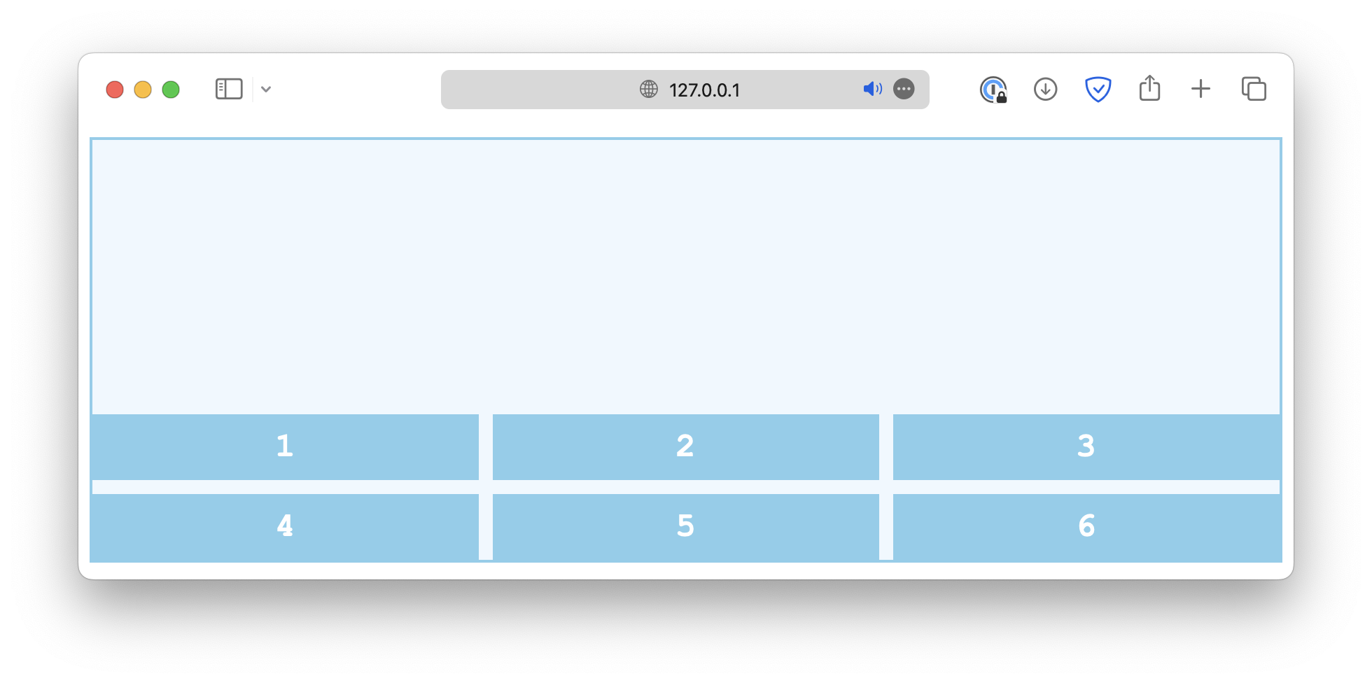
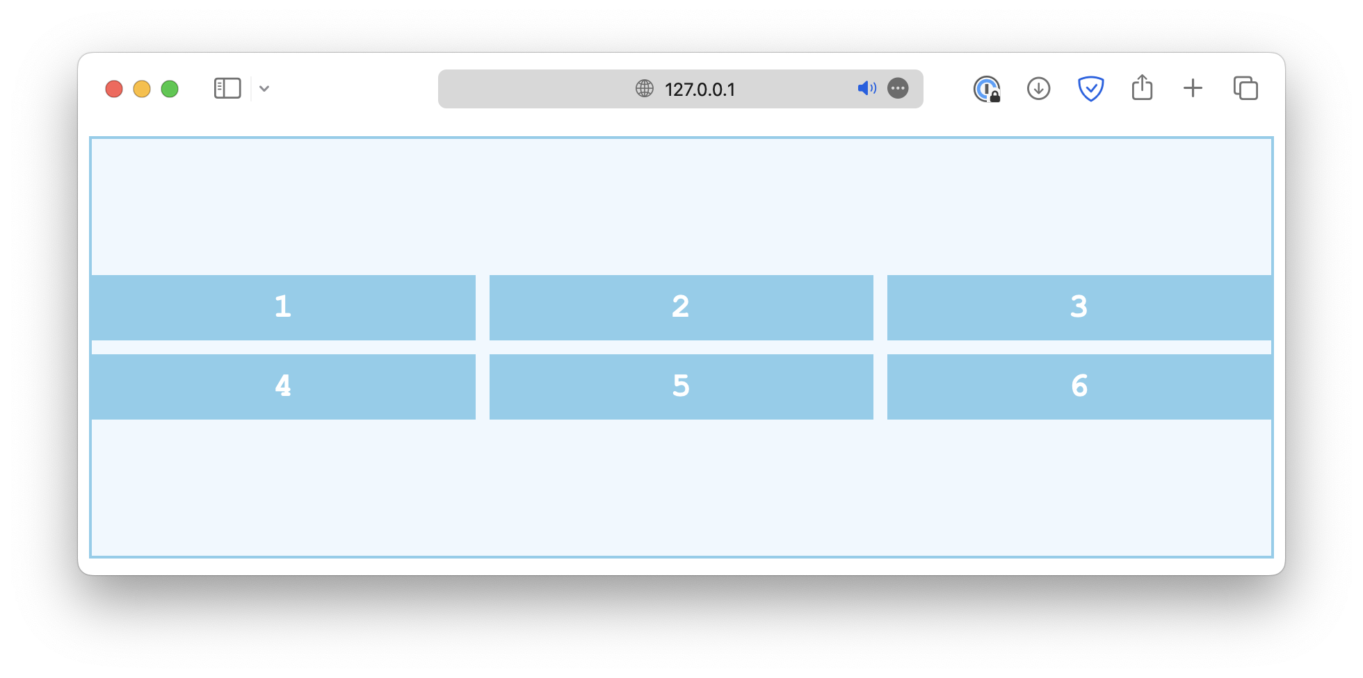
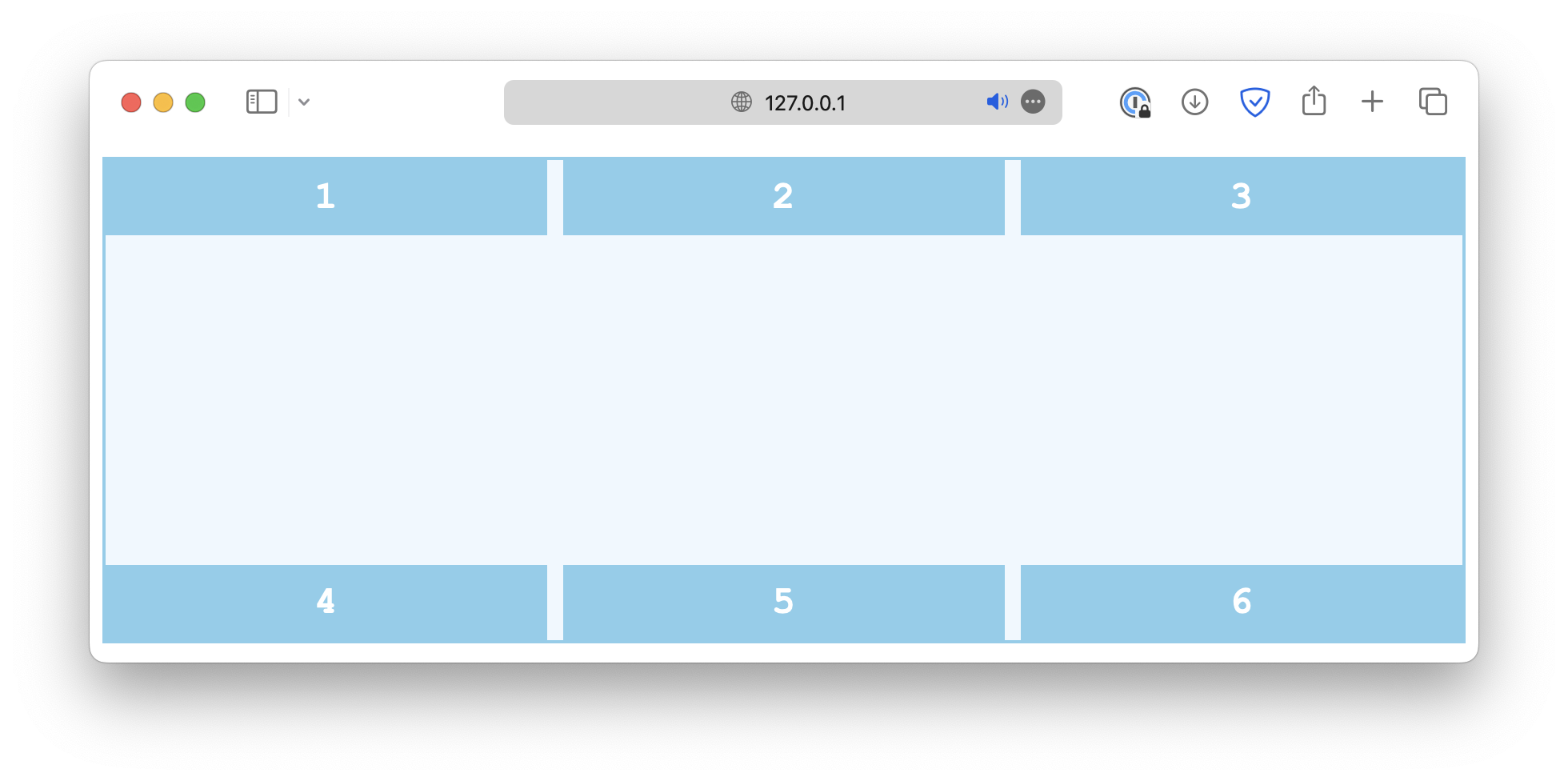
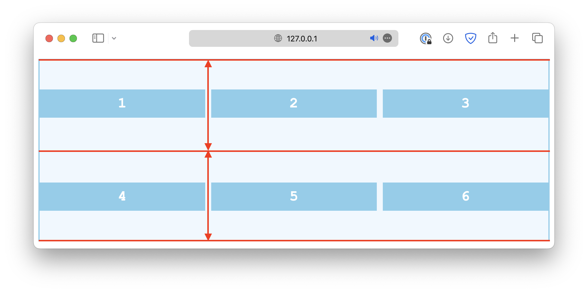
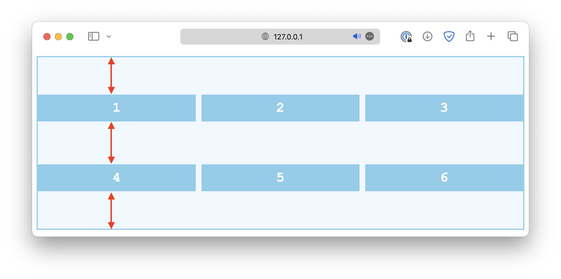
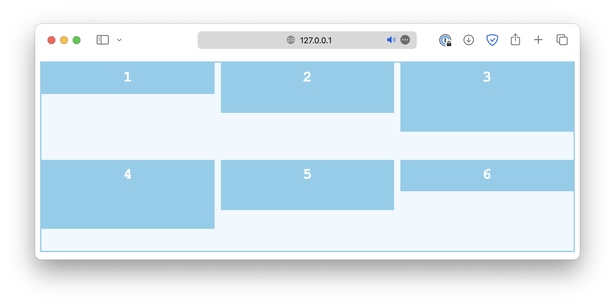
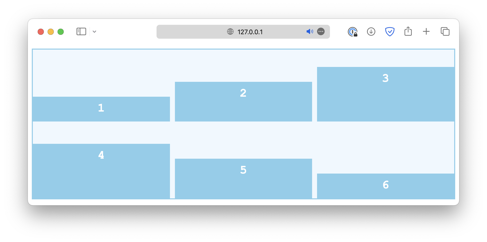
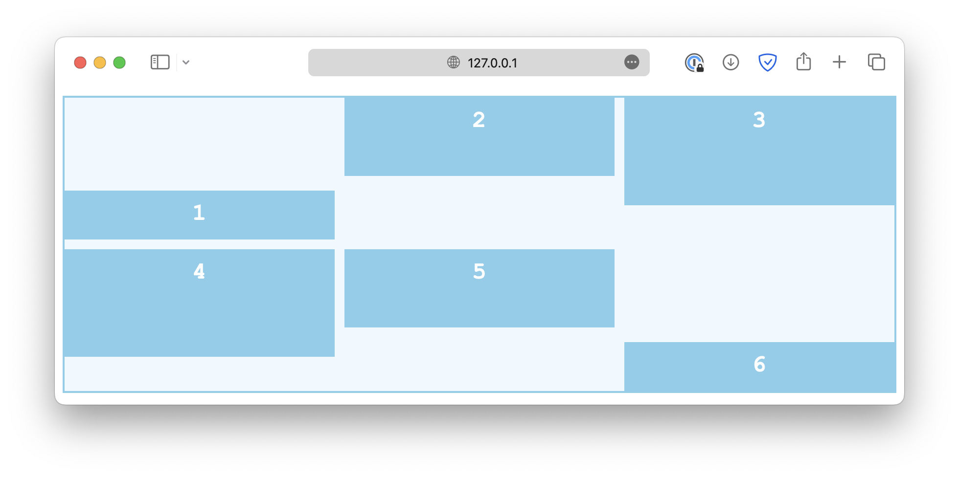
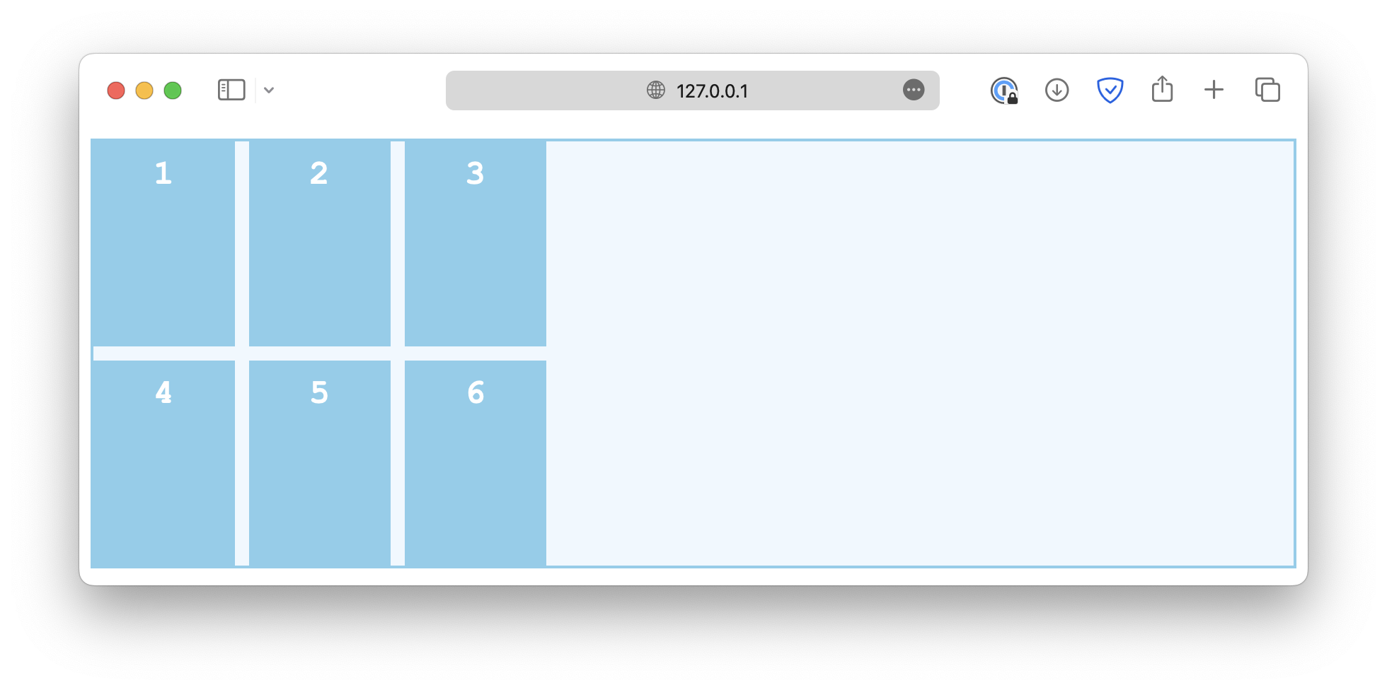
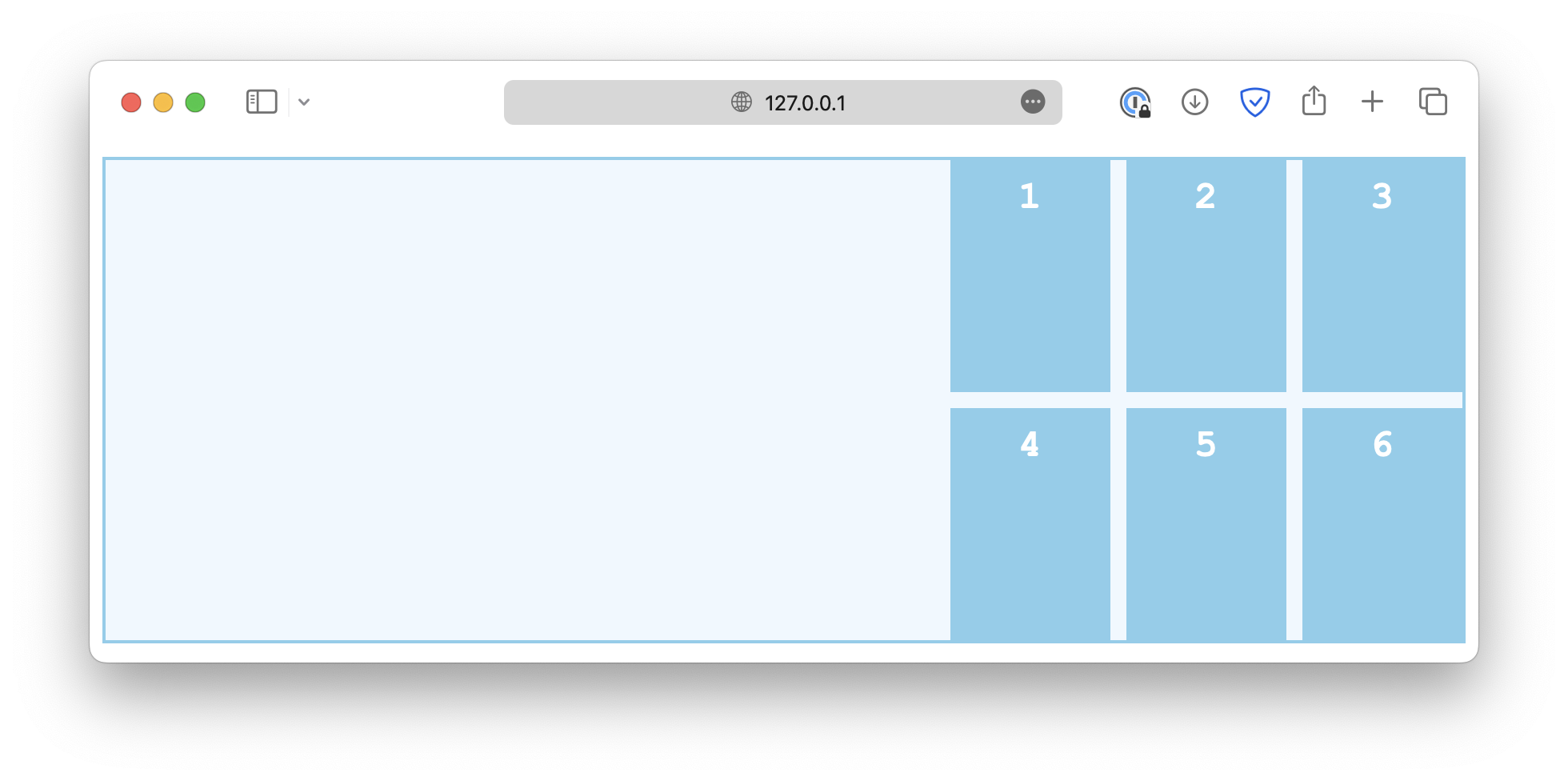
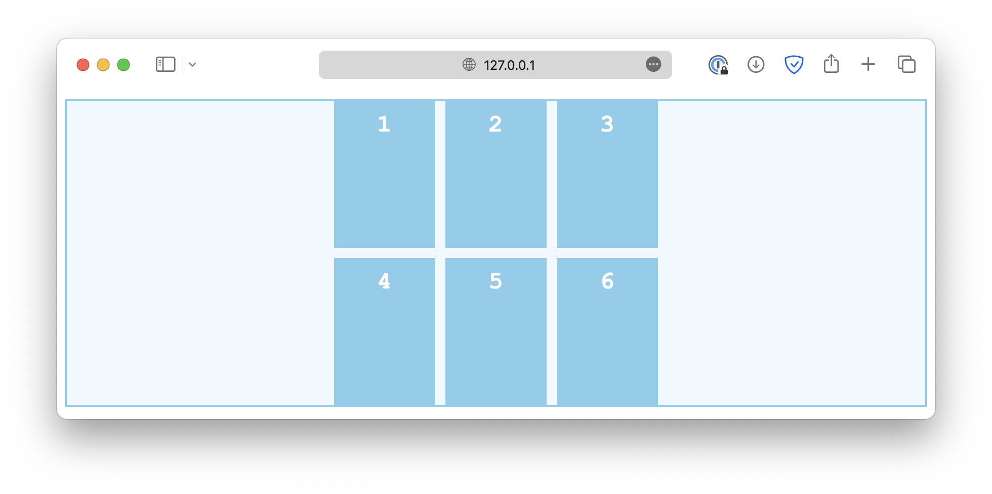
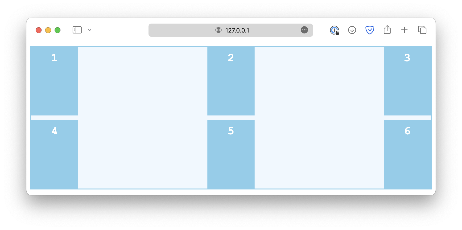
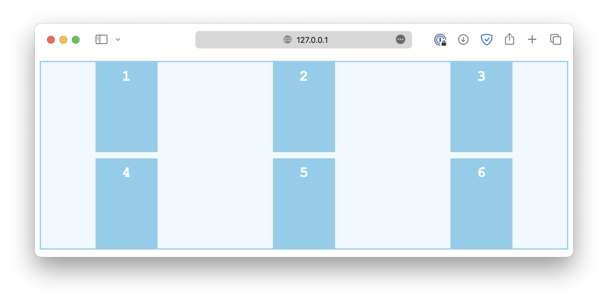
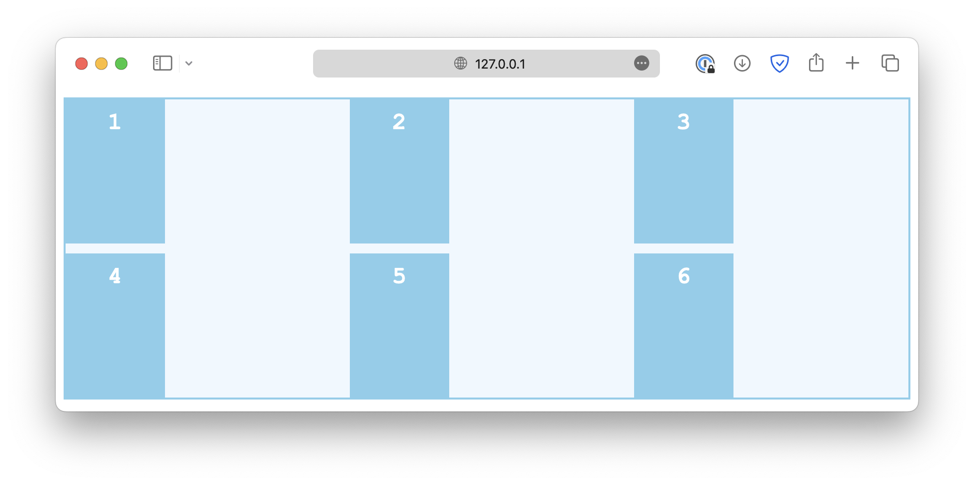
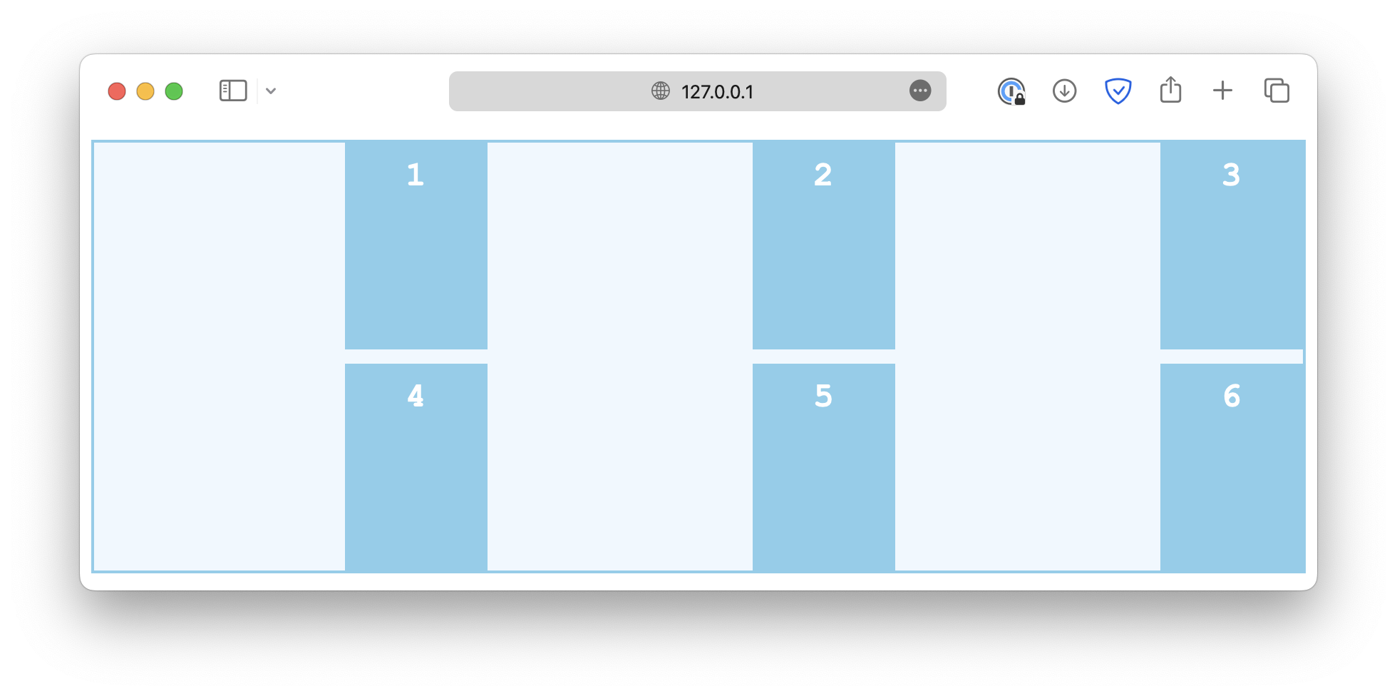
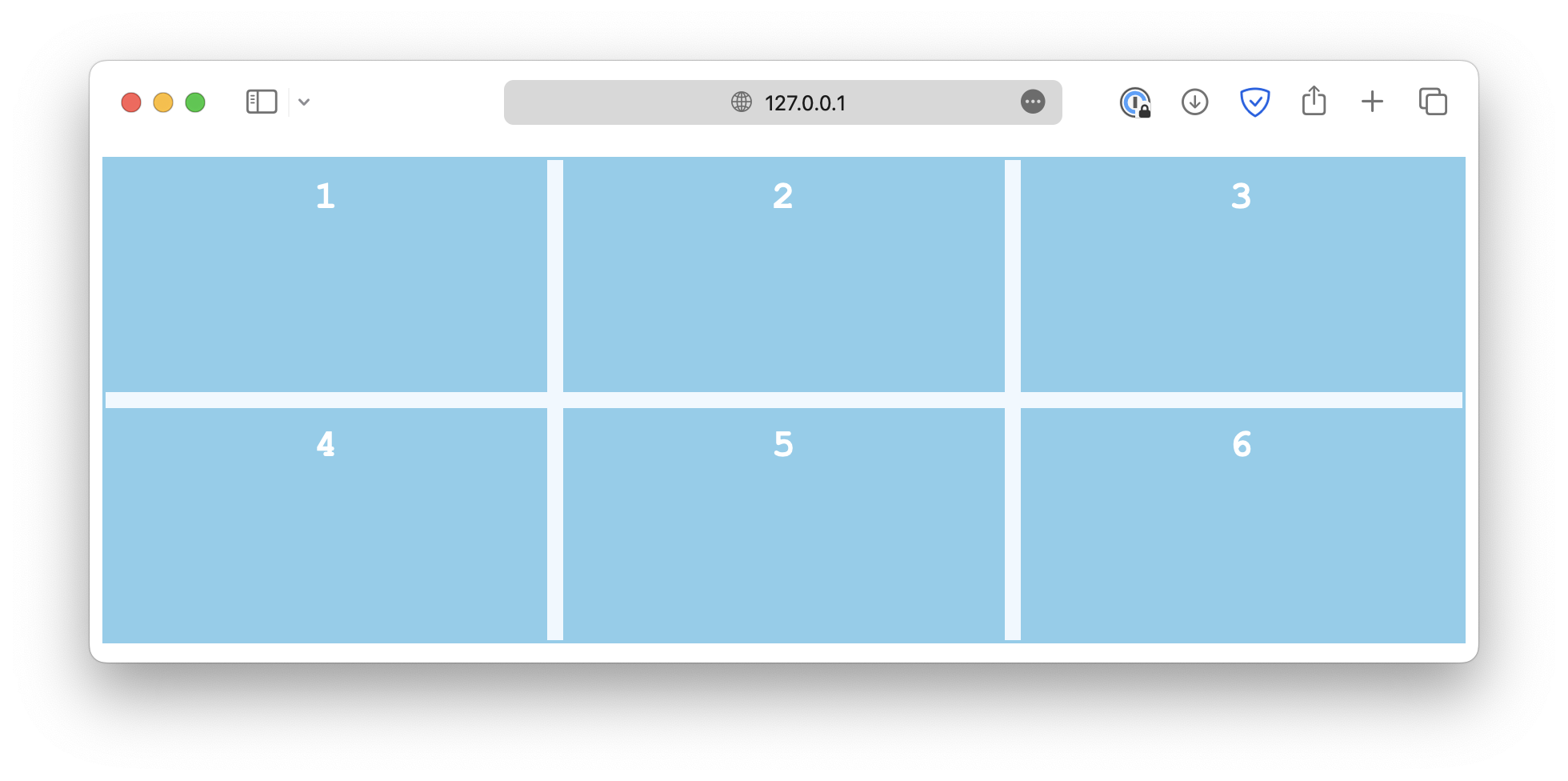
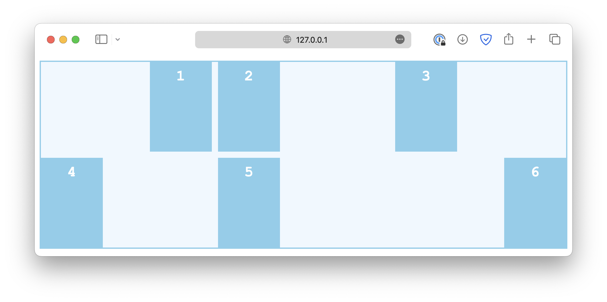
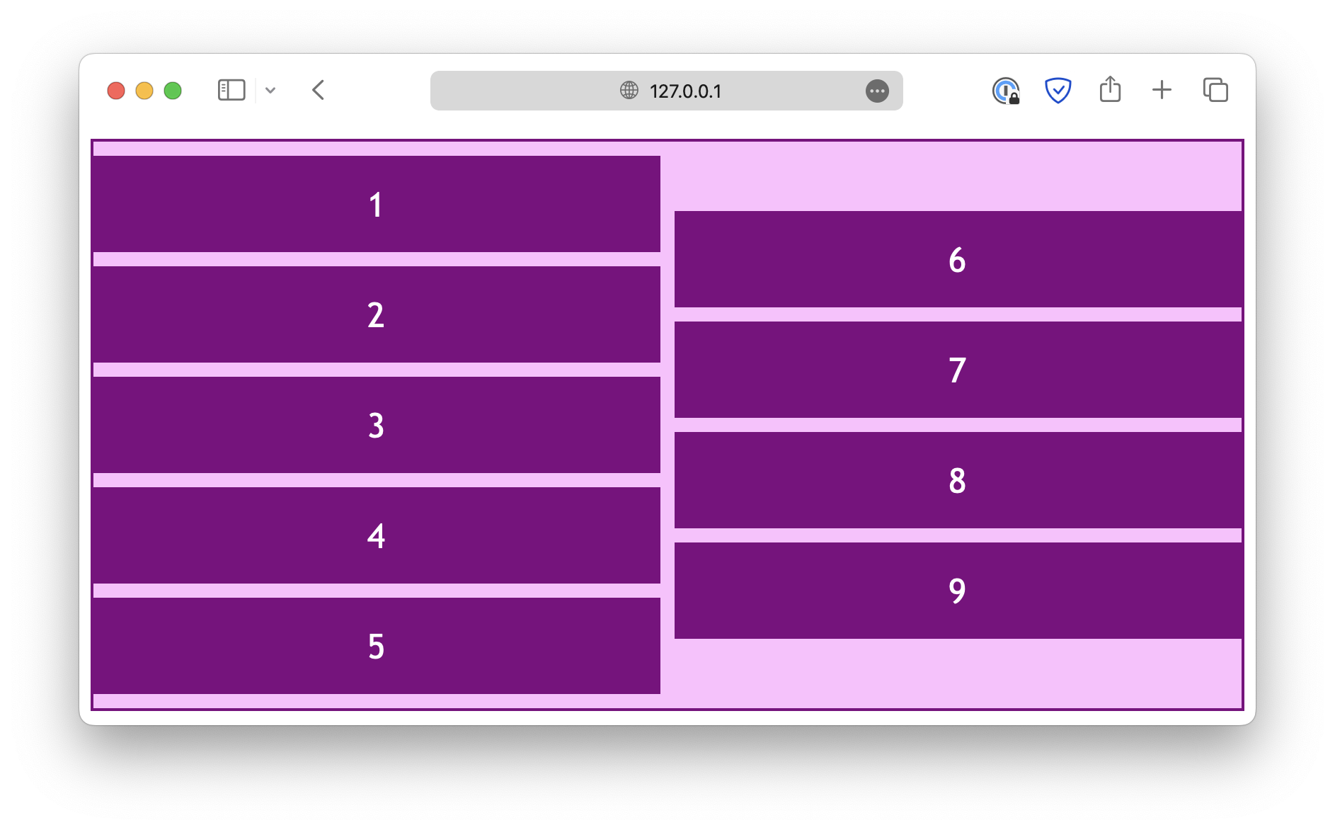
When it comes to aligning items in a grid, we have to talk about both row and column alignments. As an example, this is a grid with six items, and the grid container is 300px high:
html
<div class="container">
  <div class="item">1</div>
  <div class="item">2</div>
  <div class="item">3</div>
  <div class="item">4</div>
  <div class="item">5</div>
  <div class="item">6</div>
</div>
css
.container {
  display: grid;
  grid-template-columns: auto auto auto;
  gap: 10px;
  height: 300px;
}
Row alignment
The align-content property specifies how the rows are positioned in a multi-row grid or flex container.
css
.container {
  align-content: start;
}
The common values include:
start
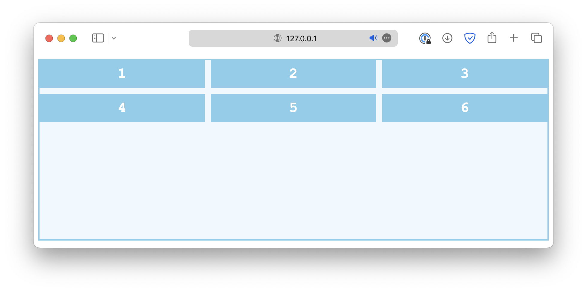
end
center
space-between
space-around
space-evenly
stretch
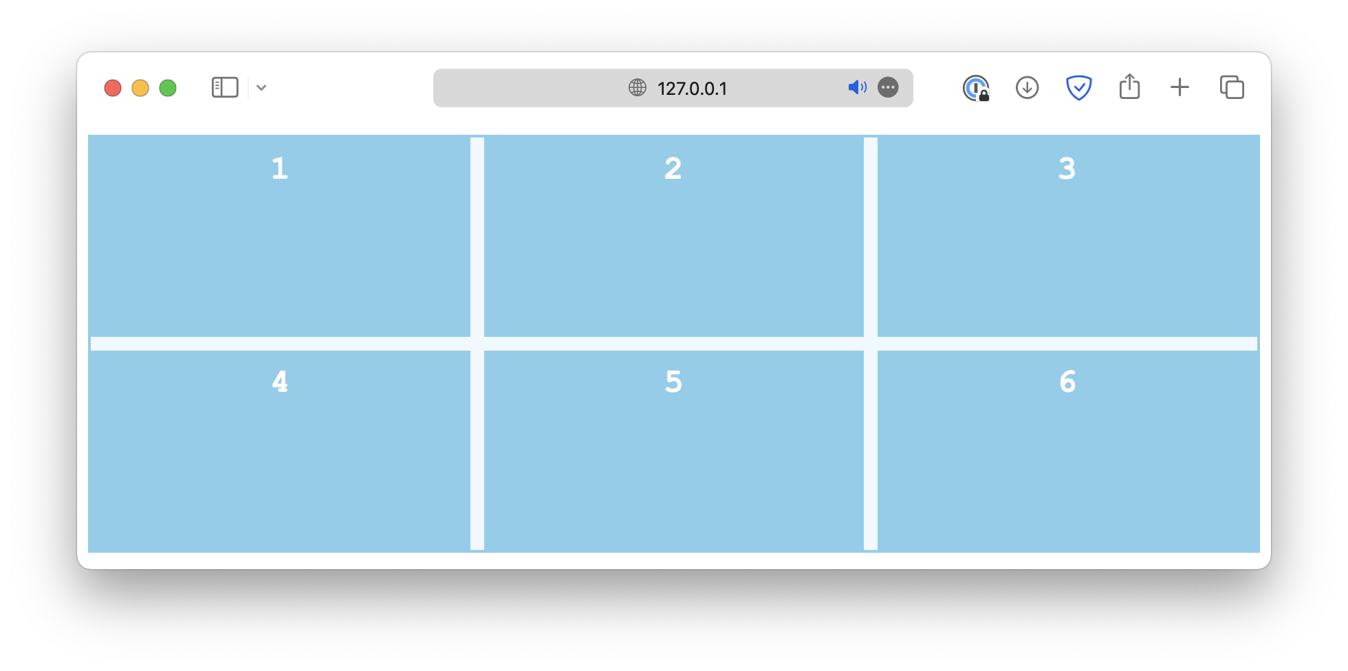
align-items, on the other hand, is used to define how the items are positioned within their respective grid cell.
css
.container {
  align-items: start;
}
Common values include:
start
end
center
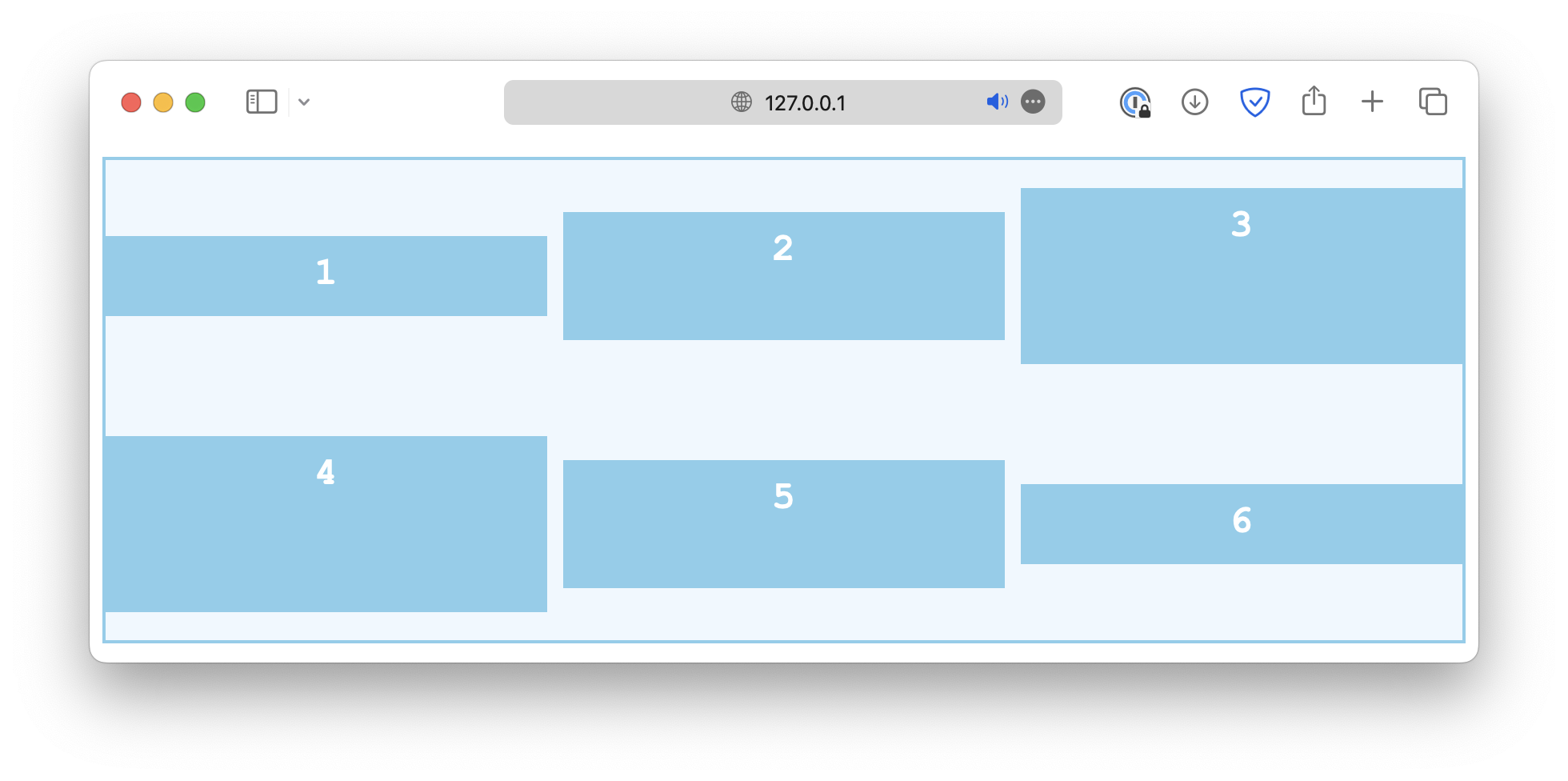
stretch

baseline
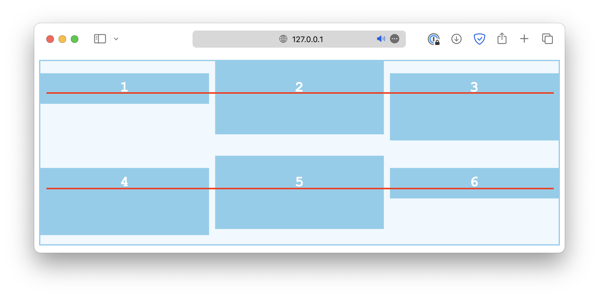
Lastly, there is an align-self property that works just like align-items, except it is used on individual grid cells instead of the container.
If the container has the align-items set, it will be overwritten by align-items.
css
.container {
  align-items: start;
}

#Item {
  align-self: end;
}
Column alignment
The column alignment, controlled by the justify properties, works in a similar way. First, the justify-content property defines how grid items are distributed horizontally along the main axis.
css
.container {
  justify-content: start;
}
Some common values are:
start
end
center
space-between
space-around
space-evenly

The justify-items controls how grid items are aligned horizontally within their cells.
css
.container {
  justify-items: start;
}
Some common values are:
start
end
center

stretch
Similarly, the justify-self property is used on individual grid items to overwrite the default alignment rule set by justify-items.
css
.container {
  justify-items: start;
}

.item-sm {
  justify-self: end;
}
Alignment in both directions
The place properties are a set of shorthand properties that control how the items are justified and aligned simultaneously. For example,
css
.container {
  display: grid;
  grid-template-columns: auto auto auto;
  gap: 10px;
  height: 300px;

  place-content: center;
}
This is the same as:
css
.container {
  display: grid;
  grid-template-columns: auto auto auto;
  gap: 10px;
  height: 300px;

  align-content: center;
  justify-content: center;
}
Besides place-content, there is also a place-items and place-self that work in a similar manner.
Flex layout
The exact same alignment properties can be used for flexbox layouts.
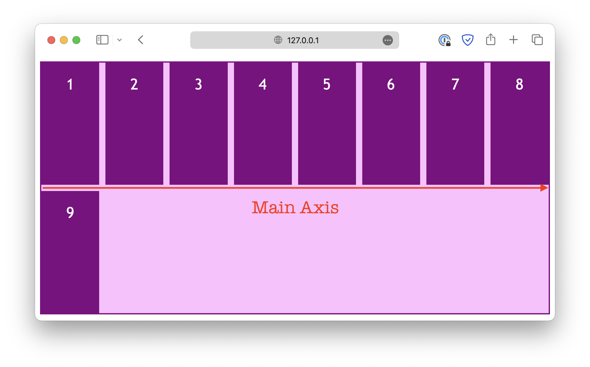
However, instead of row and column alignments, the justify properties deal with the alignment in the flexbox's main axis, which depends on the flex-direction property.
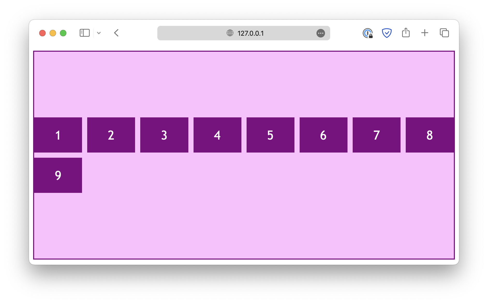
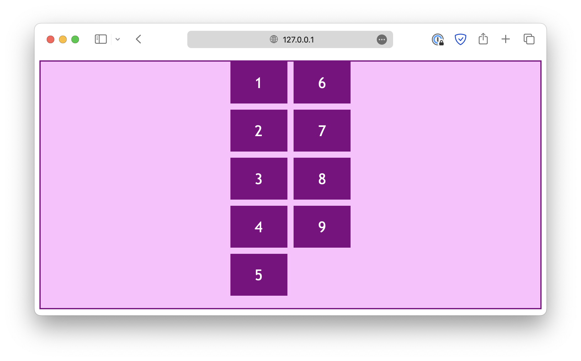
If flex-direction is set to row, the main axis is horizontal:
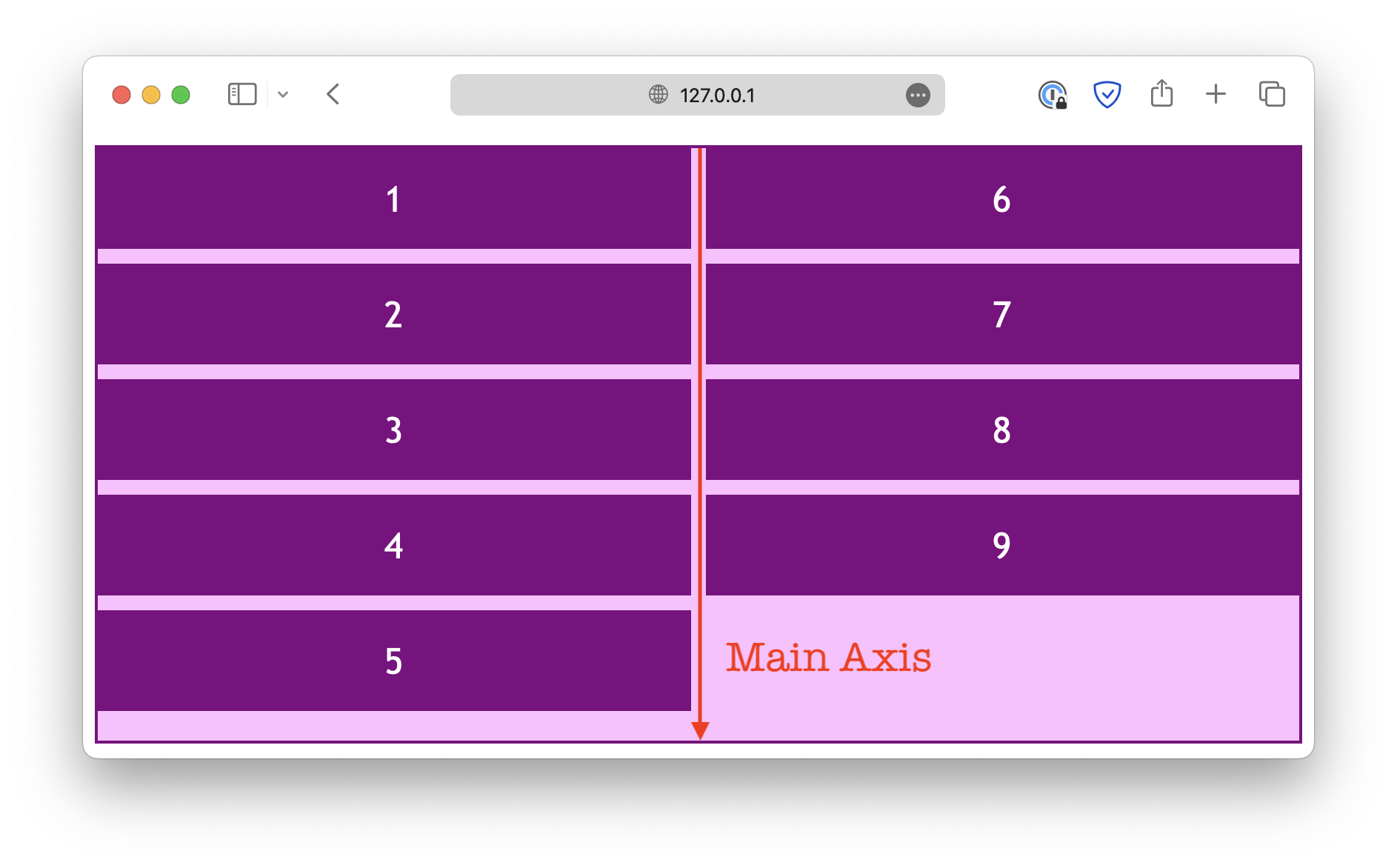
When you change the flex-direction property, the main axis also changes.
html
<div class="container">
  <div class="item">1</div>
  <div class="item">2</div>
  <div class="item" id="Item">3</div>
  <div class="item">4</div>
  <div class="item">5</div>
  <div class="item">6</div>
</div>
css
.container {
  display: flex;
  flex-direction: row; /* Experiment with this */
  flex-wrap: wrap;
  gap: 10px;
  height: 300px;

  . . .
}

#Item {
  . . .
}
Parallel to the main axis
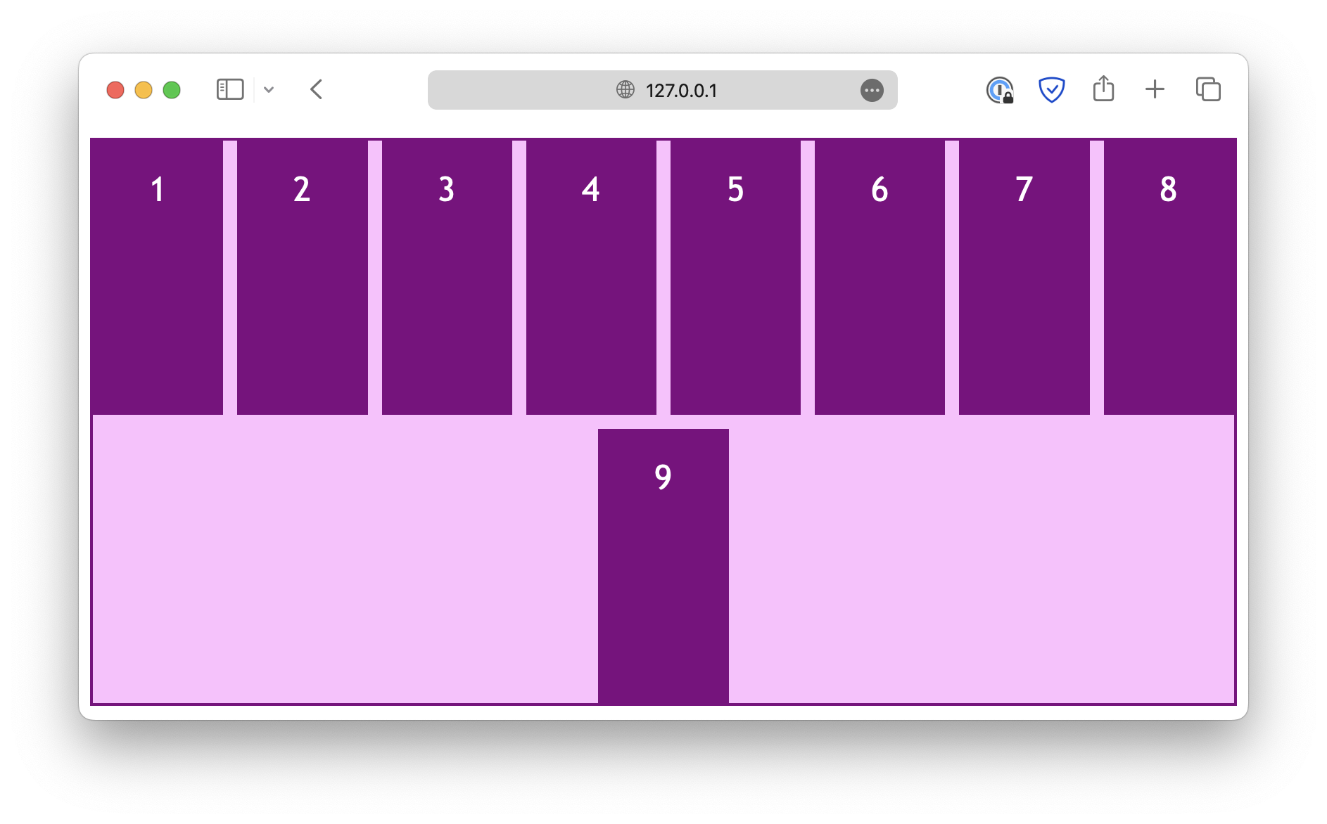
The justify properties deal with alignments in the direction parallel to the flex main axis. For example, when the flex-direction is set to row:
css
.container {
  display: flex;
  flex-direction: row;
  flex-wrap: wrap;

  height: 400px;

  /* align-content: center; */
  justify-content: center;
}
And when the flex-direction is set to column:
css
.container {
  display: flex;
  flex-direction: column;
  flex-wrap: wrap;

  height: 400px;

  /* align-content: center; */
  justify-content: center;
}
Note that the justify-items and justify-self properties are ignored in a flex layout.
Also, instead of start and end, there are flex-start and flex-end, designed specifically for a flex layout.
In most cases, the keywords start and end would also work for a flex layout, but you might need to use the flex-* keywords for the best browser compatibility.
Perpendicular to the main axis
On the other hand, the align properties deal with the alignment in the direction perpendicular to the main axis. When the flex-direction is set to row:
css
.container {
  display: flex;
  flex-direction: row;
  flex-wrap: wrap;

  height: 400px;

  align-content: center;
}
And when the flex-direction is set to column:
css
.container {
  display: flex;
  flex-direction: column;
  flex-wrap: wrap;

  height: 400px;

  align-content: center;
}
Unlike the justify properties, the align-items and align-self properties work in a flex layout.
Similarly, the place properties are a set of shorthand properties that allow you to define justification and alignment at the same time.
<!DOCTYPE html>
<html lang="en">

<head>
  <meta charset="UTF-8">
  <meta name="viewport" content="width=device-width, initial-scale=1.0">
  <title>Document</title>

  <link rel="stylesheet" href="/styles.css">
</head>

<body>
  <div class="container">
    <div class="item">1</div>
    <div class="item">2</div>
    <div class="item" id="Item">3</div>
    <div class="item">4</div>
    <div class="item">5</div>
    <div class="item">6</div>
  </div>
</body>

</html>