Loading course content...
Table of Contents
What are the CSS Filters
Code Playground is only enabled on larger screen sizes.
The filter property allows you to define visual effects that can modify the element's appearances, such as adjusting brightness, contrast, saturation, and more.
The filters are most commonly applied to images, but they also work on other HTML elements.
Each filter is defined by a CSS function.
Filters
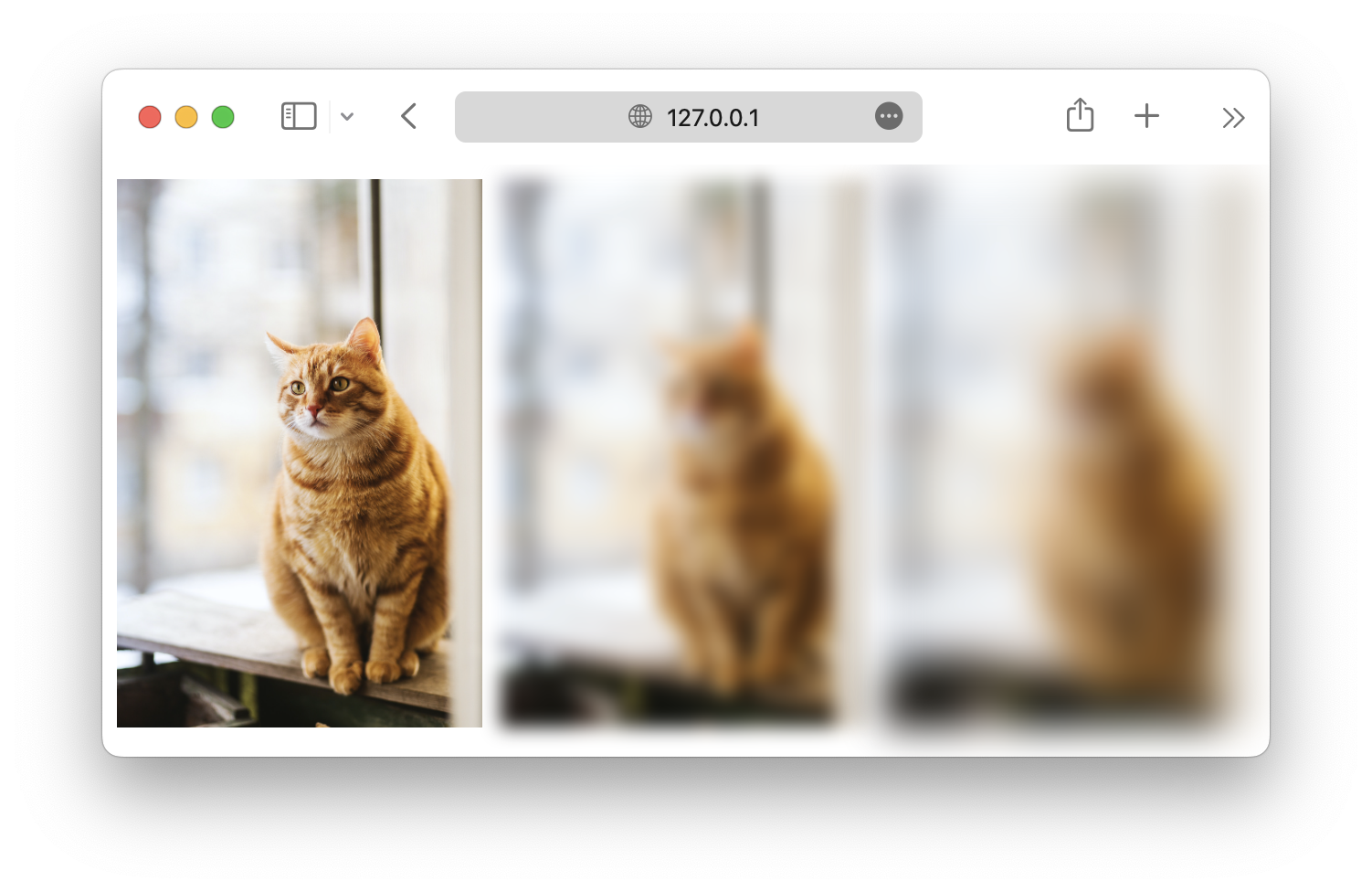
blur()
This filter applies a blur effect to the element. It accepts a blur radius as the input. A larger radius will make the image more blurred.
css
#cat1 {
  filter: blur(0px);
}

#cat2 {
  filter: blur(5px);
}

#cat3 {
  filter: blur(10px);
}
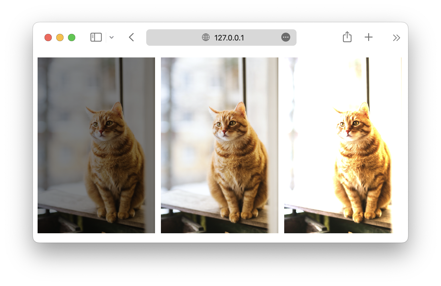
brightness()
The brightness() function controls the brightness of an element.
The function accepts a percentage value argument, 0% will make the element completely dark, 100% will be the original image, and values higher than that will make the element brighter.
css
#cat1 {
  filter: brightness(50%);
}

#cat2 {
  filter: brightness(100%);
}

#cat3 {
  filter: brightness(150%);
}
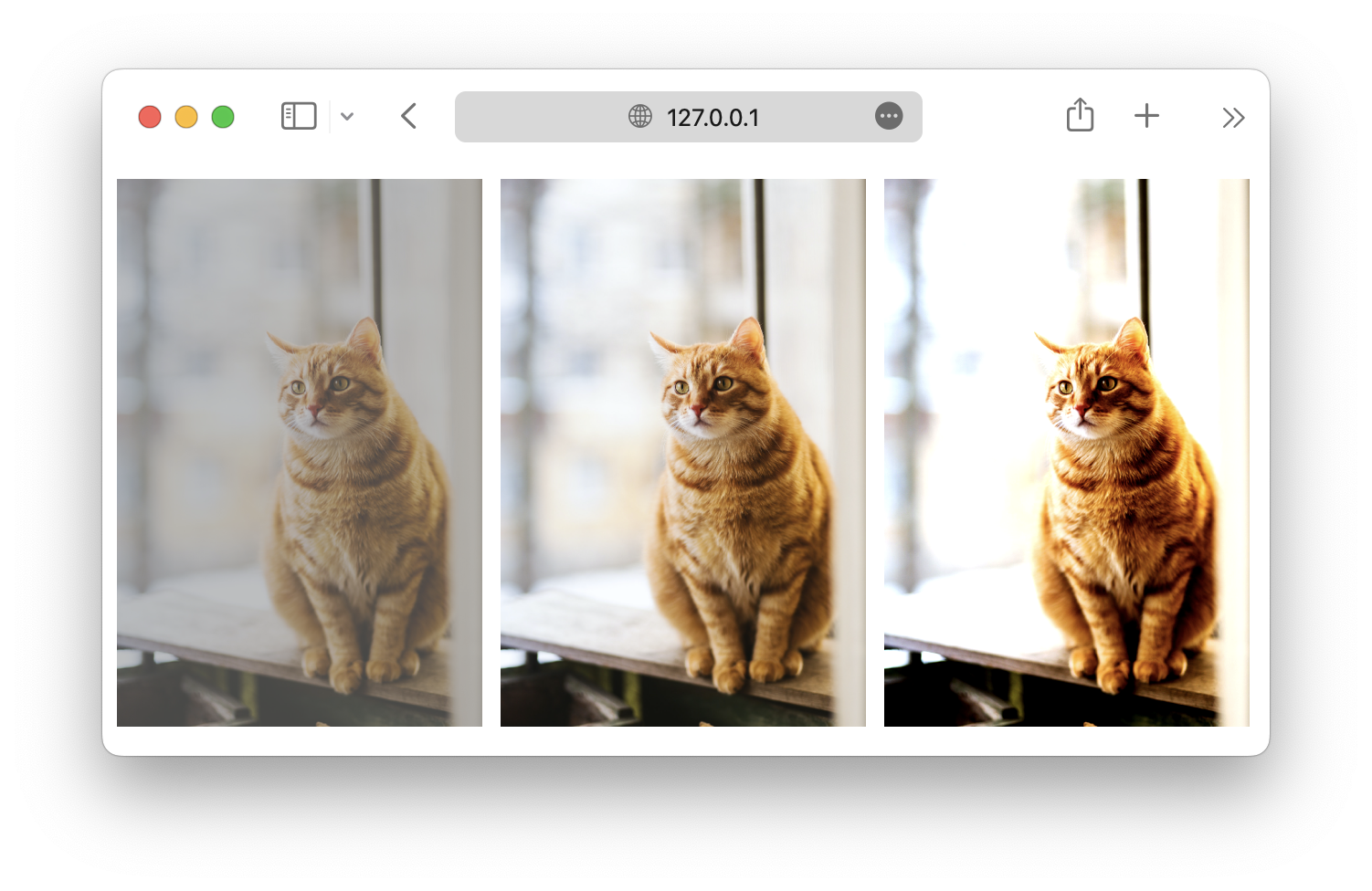
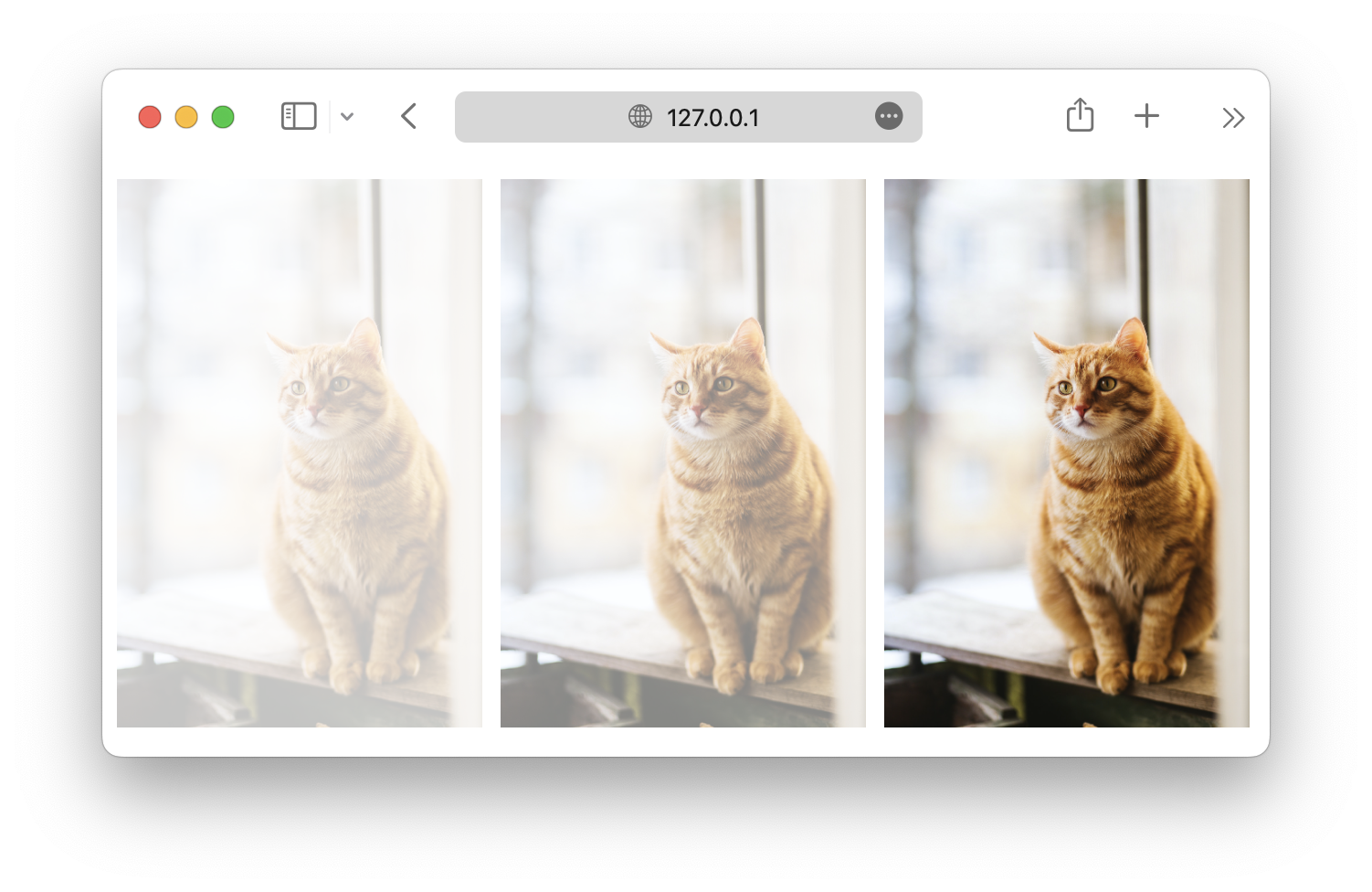
contrast()
The function controls the contrast of the element, and it works similarly to the brightness() function.
The function also accepts a percentage value argument. 0% will make the element completely dark, 100% will be the original, and higher values will give the element more contrast.
css
#cat1 {
  filter: contrast(50%);
}

#cat2 {
  filter: contrast(100%);
}

#cat3 {
  filter: contrast(150%);
}
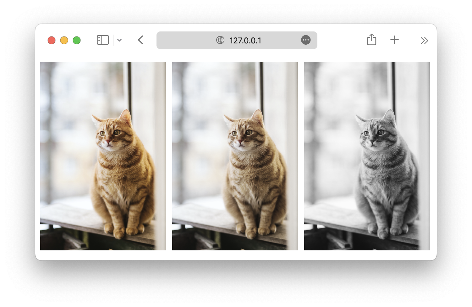
grayscale()
Turns the element into a grayscale image.
The function accepts percentage values from 0% to 100%. 0% will be the original, and 100% will turn the element black and white.
css
#cat1 {
  filter: grayscale(25%);
}

#cat2 {
  filter: grayscale(50%);
}

#cat3 {
  filter: grayscale(100%);
}
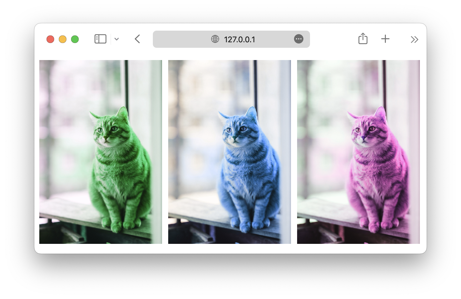
hue-rotate()
This function will perform a hue rotation on the image based on the provided rotation degree, from 0deg to 360deg.
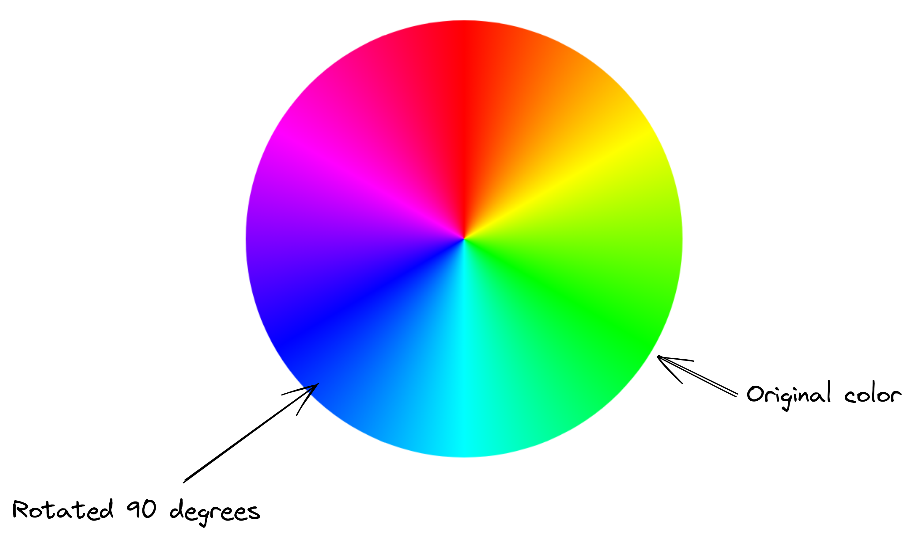
So, if we perform a 90deg hue rotation, the green color in the original image will become blue.
css
#cat1 {
  filter: hue-rotate(90deg);
}

#cat2 {
  filter: hue-rotate(180deg);
}

#cat3 {
  filter: hue-rotate(270deg);
}
invert()
Inverts the original image. 0% is the original, and 100% inverts the image completely.
css
#cat1 {
  filter: invert(0%);
}

#cat2 {
  filter: invert(50%);
}

#cat3 {
  filter: invert(100%);
}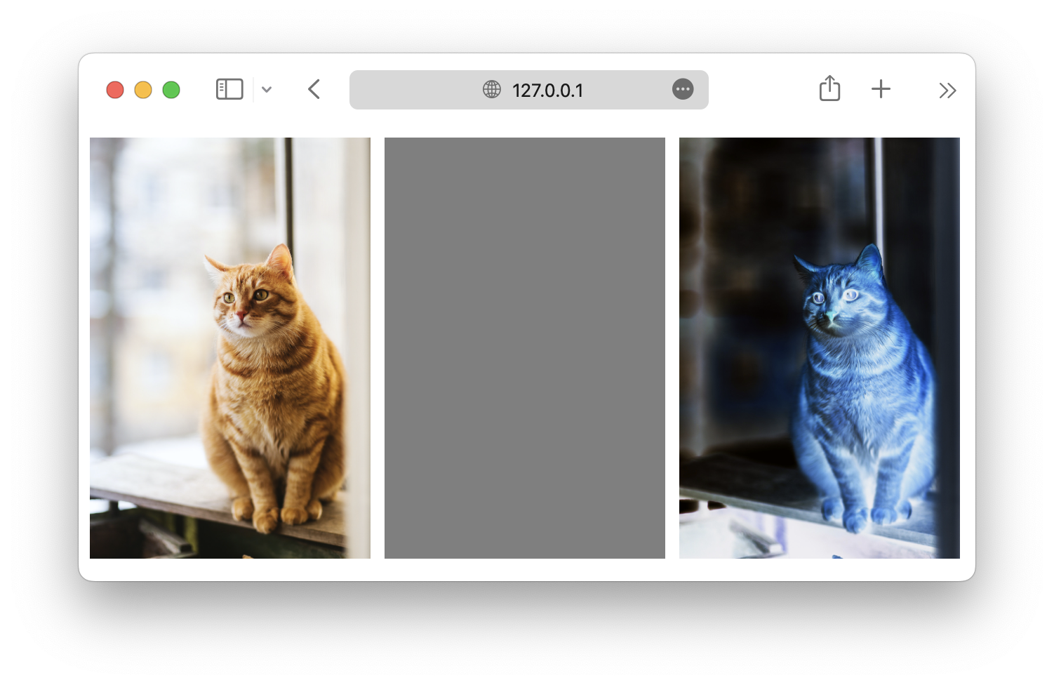
opacity()
Controls the image's opacity from 0% (completely invisible) to 100% (completely visible).
css
#cat1 {
  filter: opacity(25%);
}

#cat2 {
  filter: opacity(50%);
}

#cat3 {
  filter: opacity(100%);
}
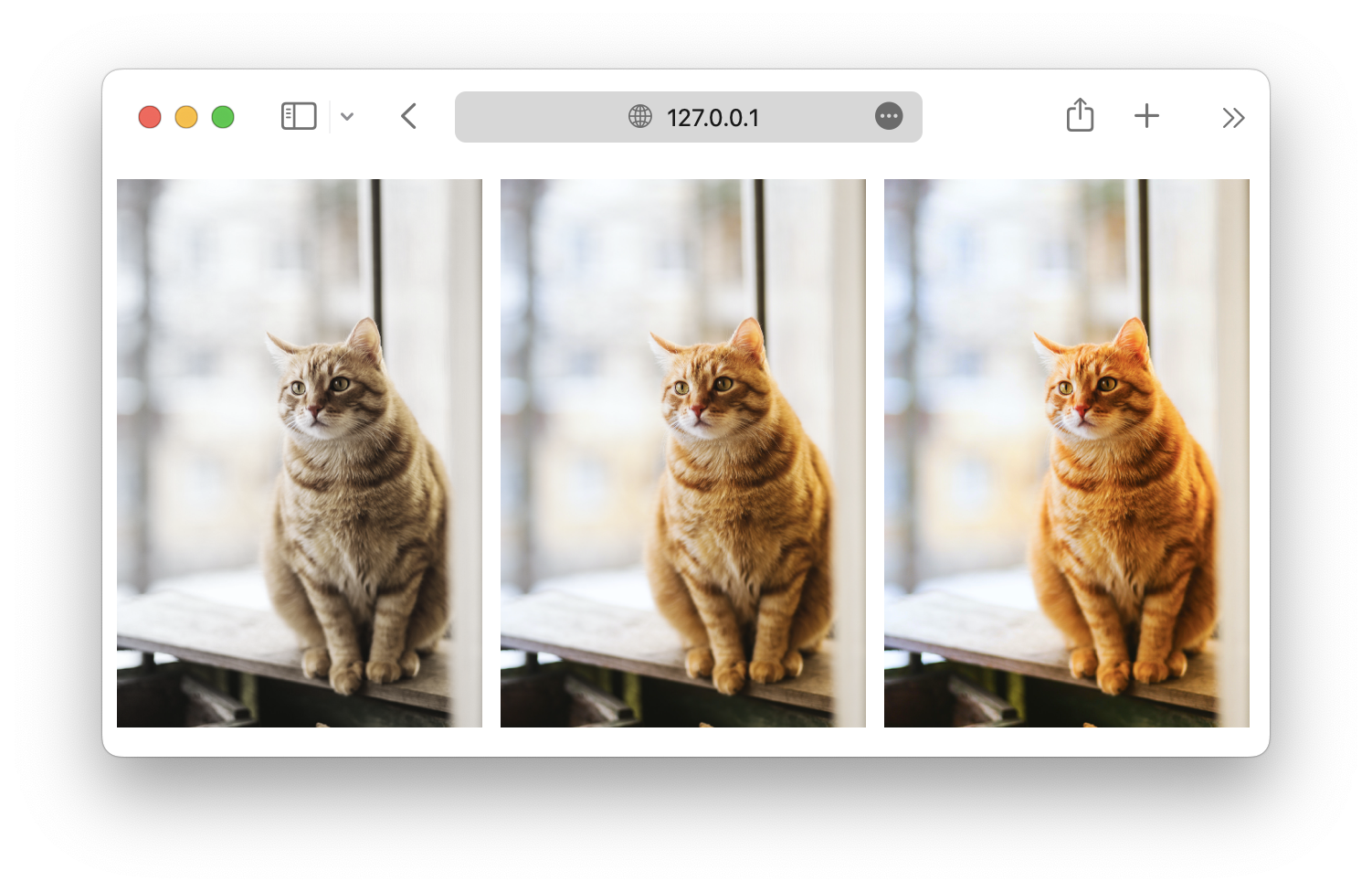
saturate()
Controls the saturation of the image. 100% is the original, values lower than that make the image less saturated, and values higher than that make the image more saturated.
css
#cat1 {
  filter: saturate(50%);
}

#cat2 {
  filter: saturate(100%);
}

#cat3 {
  filter: saturate(150%);
}
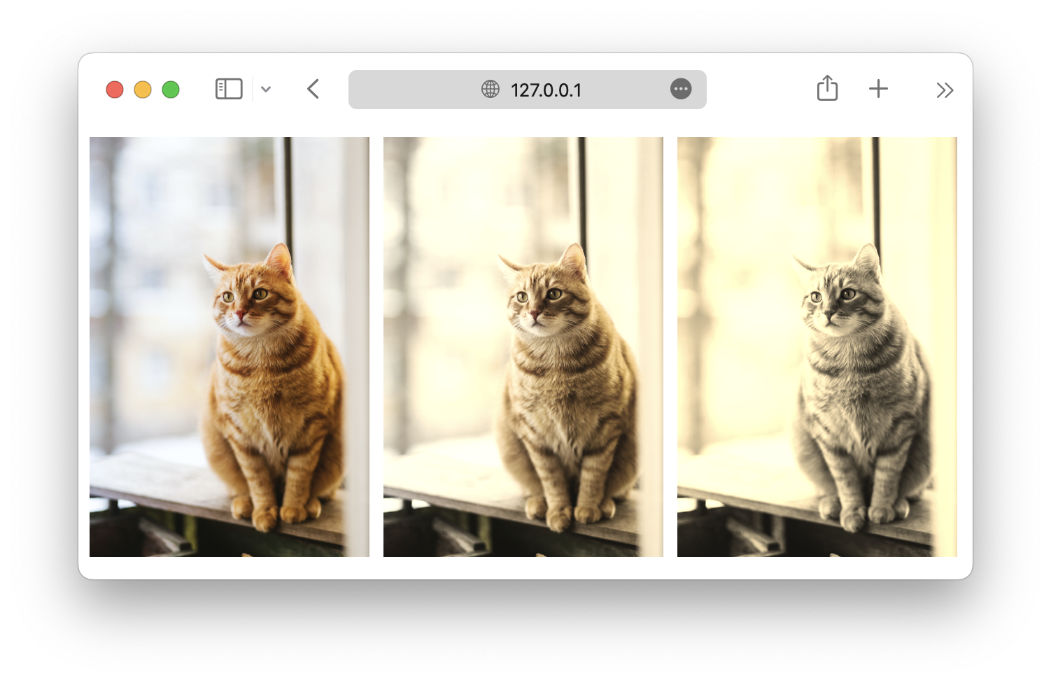
sepia()
Sepia is a reddish-brown color, which makes the image appear old. The function accepts values from 0% to 100%.
css
#cat1 {
  filter: sepia(0%);
}

#cat2 {
  filter: sepia(50%);
}

#cat3 {
  filter: sepia(100%);
}
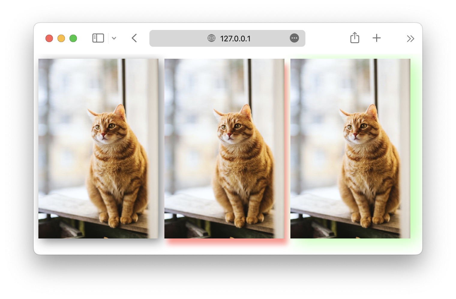
drop-shadow()
This filter works similarly to the box-shadow property, which adds a drop shadow to the element.
The function accepts arguments that allow you to define the shadow position (horizontal and vertical offset), radius, and color.
css
#cat1 {
  filter: drop-shadow(5px 5px 10px rgba(0, 0, 0, 0.5));
}

#cat2 {
  filter: drop-shadow(5px 10px 5px rgba(255, 0, 0, 0.5));
}

#cat3 {
  filter: drop-shadow(10px 5px 15px rgba(0, 255, 0, 0.5));
}
The filter functions discussed above can also be used together to create a more complex effects. For instance:
css
#cat {
  filter: drop-shadow(5px 5px 10px rgba(0, 0, 0, 0.5)) saturate(150%);
}
Backdrop filters
Besides the filter property, there is also a backdrop-filter, which allows you to apply filter effects to the area behind an element rather than the element itself.
It is primarily used to create effects like blurring, or adjusting the contrast between the main content and the element behind that content.
For example, you can use the backdrop filter to create a glassmorphism effect like this:
html
<body>
  <img src="cat.jpg" alt="cat" width="200px" id="cat" />
  <div class="glass"></div>
</body>
css
.glass {
  position: absolute;
  top: 50px;
  left: 30px;
  width: 150px;
  height: 150px;
  backdrop-filter: blur(5px);
  -webkit-backdrop-filter: blur(5px); /* Make Safari compatible */
  border-radius: 10px;
  margin: auto;
  z-index: 1; /* Place the glass on top of the image */
}

#cat {
  position: relative;
  z-index: 0; /* Ensure the image is behind the glass */
}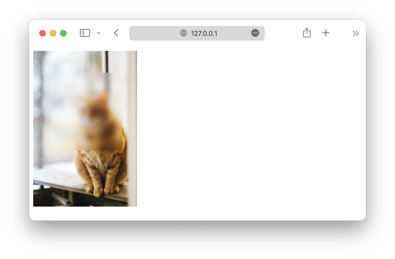
In this example, the z-index property is used to order the elements when they are stacked on top of each other.
<!DOCTYPE html>
<html lang="en">

<head>
  <meta charset="UTF-8">
  <meta name="viewport" content="width=device-width, initial-scale=1.0">
  <title>Document</title>

  <link rel="stylesheet" href="/styles.css">
</head>

<body>
  <img src="https://picsum.photos/id/237/200/300" alt="Placeholder Image" id="Img1">
  <img src="https://picsum.photos/id/237/200/300" alt="Placeholder Image" id="Img2">
  <img src="https://picsum.photos/id/237/200/300" alt="Placeholder Image" id="Img3">
</body>

</html>