Loading course content...
What is Responsive Design
Code Playground is only enabled on larger screen sizes.
Providing a consistent and optimal user experience across a wide range of devices is a crucial task in webpage design. In the old days, developers would create two different versions of the same webpage, one for desktops and the other for mobile devices.
However, nowadays, electronic devices come with various screen sizes and resolutions. It is impractical to create and maintain so many versions of the same webpage.
Instead, developers would use a new design approach called responsive design, which aims to create webpages that automatically adapt and adjust their layout, content, and functionality based on the device being used to access the webpage.
Responsive design is not a new technology or a programming language. You are still using the same old HTML and CSS we've been talking about. It is a set of best practices you should follow when designing your webpage.
Setting the viewport
The first thing you must do when creating a responsive layout is to add the following <meta> tag in the <head> section of the webpage.
<meta name="viewport" content="width=device-width, initial-scale=1.0" />When the mobile browser displays a webpage, it will first render the default desktop version and then try to scale the content to fit the screen size. This viewport tag tells the browser how to control the scaling of the page.
The width=device-width attribute sets the width of the viewport to equal to the width of the screen, making sure the content is displayed at the device's actual size. Without it, the webpage may be displayed at the default desktop width.
In some cases, the browser may "lie" about the screen size, especially on high-density screens, which often use multiple physical pixels to represent one digital pixel. This attribute makes sure that the page is scaled correctly across all devices.
The initial-scale sets the initial zoom level when the webpage is first loaded. By setting initial-scale to 1.0 you are telling the browser one physical pixel should equal one digital pixel, meaning the page does not zoom. This is important because it prevents the webpage from being automatically zoomed in or out when first opened on a mobile device.
⬇️ No viewport tag
⬇️ With viewport tag
Media queries and breakpoints
The media query is a technique that allows you to selectively apply a block of CSS code. For example, the following @media rule specifies that the enclosed styles will only be activated for screen media (not printed documents), and the viewport has a maximum width of 767px.
@media screen and (max-width: 767px) {
  .container {. . .}
  .items {. . .}
}
The @media rule has the following syntax:
@media <media_type> and (<media_feature>) {
  /* . . . */
}
The <media_type> argument is optional, and it specifies the type of media you are targeting. Some common media types include screen (electronic screens such as smartphones, laptops, and so on), print (used for print preview), speech (used for screen readers), and all (all devices).
The <media_feature> argument is where you can add conditions to the media query. The condition could be the width of the viewport (min-width or max-width), the orientation of the device (orientation), or the actual screen size of the target device (device-width and device-height).
The media query plays a significant role in responsive design, as it allows you to define different styles for different viewports. For instance:
.container {
  background-color: lightblue;
  font-size: xx-large;
}

@media screen and (min-width: 640px) {
  .container {
    background-color: lightcoral;
  }
}
In this example, the text background will be lightblue when the viewport is smaller than 640px. Now, resize your browser, and when the viewport is larger than 640px, the background will turn into lightcoral.
⬇️ Smaller than 640px
⬇️ Larger than 640px
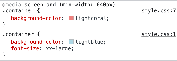
The font size remains the same even though we did not define a font-size property for the min-width: 640px media query. The property will simply be inherited from the original .container styles. You may check what CSS styles are active using your browser's developer tools.
Notice that the background-color: lightblue; style has been crossed off, meaning it is not currently active, but the font-size: xx-large; style is.
The 640px we are using in this example is a commonly used breakpoint separating small screen devices (such as smartphones) and others. Usual breakpoints include:
@media screen and (min-width: 640px) {
  /* Small devices such as smartphones */
}

@media screen and (min-width: 768px) {
  /* Medium devices such as tablets */
}

@media screen and (min-width: 1024px) {
  /* Large devices such as laptops */
}

@media screen and (min-width: 1280px) {
  /* Largest devices such as desktops */
}
Notice that in these examples, we are only using min-width as the condition. This is because when designing responsive webpages, it is recommended to follow the mobile first convention, meaning you start with the smallest viewport and work your way up to the big screens.
<!DOCTYPE html>
<html lang="en">

<head>
  <meta charset="UTF-8">
  <meta name="viewport" content="width=device-width, initial-scale=1.0">
  <title>Document</title>

  <link rel="stylesheet" href="/styles.css">
</head>

<body>
  <p>Hello, World!</p>
</body>

</html>


