Loading course content...
Table of Contents
How to Make Your Images & Texts Responsive
Code Playground is only enabled on larger screen sizes.
Images and texts are the two most important components in modern web design, so it is crucial to make sure they look perfect on all devices.
Making your images responsive
By default, the images embedded in the webpage will be displayed in a pixel-to-pixel manner, with one image pixel matching one viewport pixel, which means the image will likely be either too large or too small for the current viewport.
For an image to be displayed properly on any device, you should define a size with a relative unit such as % or vw.
css
img {
  max-width: 50vw;
}
Sometimes, an image must be displayed with a fixed aspect ratio.
For example, a profile avatar usually has a 1:1 aspect ratio, but the images might come in different sizes, especially for user-uploaded images.
If you only define an aspect-ratio property, the image will be stretched or squished.
css
img {
  max-width: 50vw;
  aspect-ratio: 1/1;
}
In this case, you can use the object-fit property to specify how the image should be displayed in the defined space.
- The default option,
fill, will stretch or squish the image to fit the given dimension.
css
img {
  max-width: 50vw;
  aspect-ratio: 1/1;
  border: 2px solid black;

  object-fit: fill;
}
containkeeps the image's original dimension and resizes the image to fit the space.

coverkeeps the image's original dimension, and resizes and crops the image to fill the space.

nonekeeps the image's original dimension and size.

scale-downkeeps the element's original dimension and scales the image down to fit the space. Unlikecontain, if the image is smaller than the defined space, it will not be scaled up to fit the space.

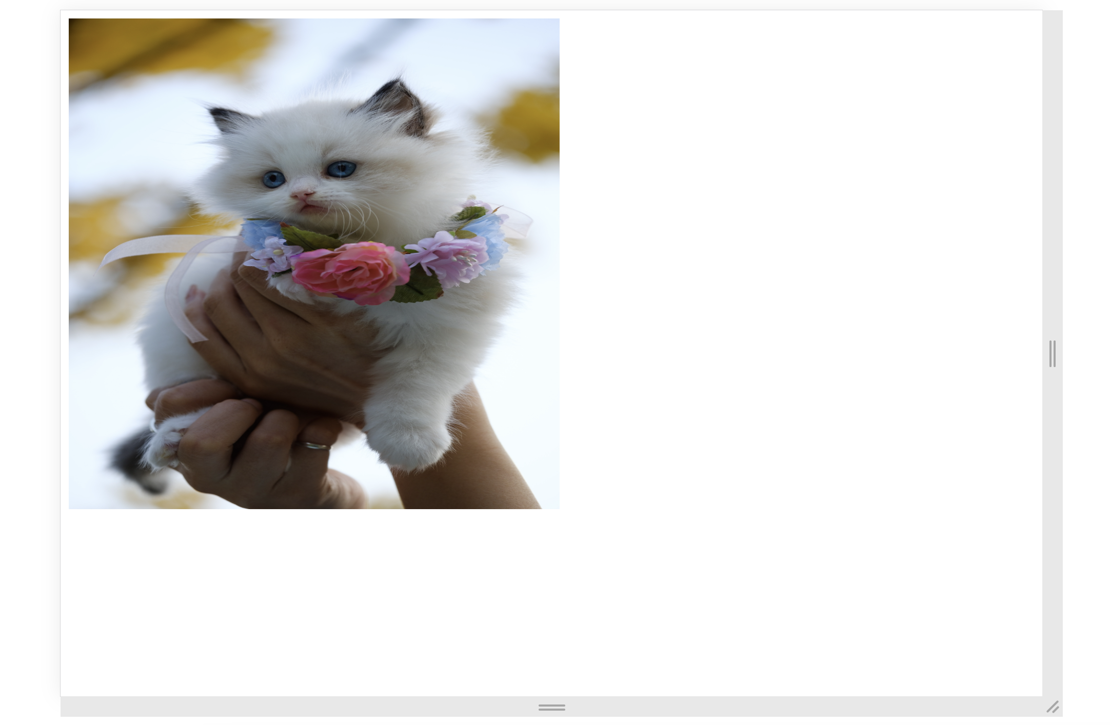
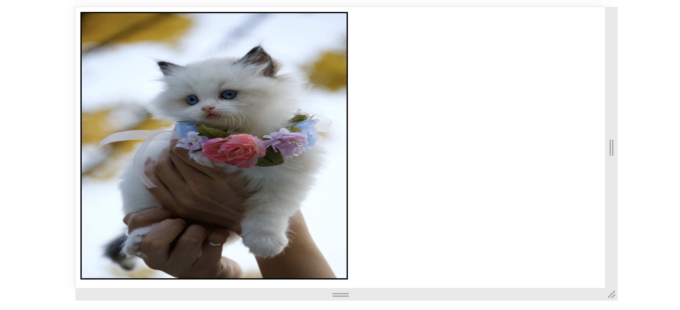
In order to use the image as a profile avatar, it is best to set object-fit to cover. Because it will not change the image's aspect ratio, and the defined space will be completely filled.
However, notice that the image is zoomed in on the center, which caused the cat's ear to be cropped off. In this case, you could adjust the position of the image using the object-position property, which has the following syntax:
text
object-position: <horizontal_position> <vertical_position>;For example,
css
img {
  max-width: 50vw;
  aspect-ratio: 1/1;
  border: 2px solid black;

  object-fit: cover;
  object-position: 50% 10%;
}
This CSS code lets the browser zoom in on the top portion of the image, putting the cat at the center of the defined space.
Making your texts responsive
Besides images, we also need to talk about typography when it comes to responsive design.
You should never set a fixed size for your fonts if the webpage is intended to be responsive. The font size suitable for large screens might not be appropriate for your smartphone, and the font size that is appropriate for your smartphone might be difficult to see on the desktop.
One common solution for this issue is to use media queries:
css
h1 {
  font-size: 2rem;
}

@media (min-width: 640px) {
  h1 {
    font-size: 4rem;
  }
}

/* . . . */
But then, we face the same problem as before, there are too many breakpoints we need to create. Alternatively, you can define the font size using viewport relative units, letting the browser choose the best font size.
html
<body>
  <p class="responsive">Lorem. . .</p>
  <p class="original">. . .</p>
</body>
css
.responsive {
  font-size: 5vw;
}
This method, however, will take away the user's ability to zoom texts in or out because the font size is always relative to the viewport.
To fix this, you can use the calc() function to add two values together. If you add vw to a fixed value (em or rem), then the texts will be zoomable.
css
.responsive {
  font-size: calc(2vw + 1em);
}
Now, the texts will be responsive and zoomable at the same time.

<!DOCTYPE html>
<html lang="en">

<head>
  <meta charset="UTF-8">
  <meta name="viewport" content="width=device-width, initial-scale=1.0">
  <title>Document</title>

  <link rel="stylesheet" href="/styles.css">
</head>

<body>
  <p>Hello, World!</p>
</body>

</html>